Blue Cross Blue Shield Community Report
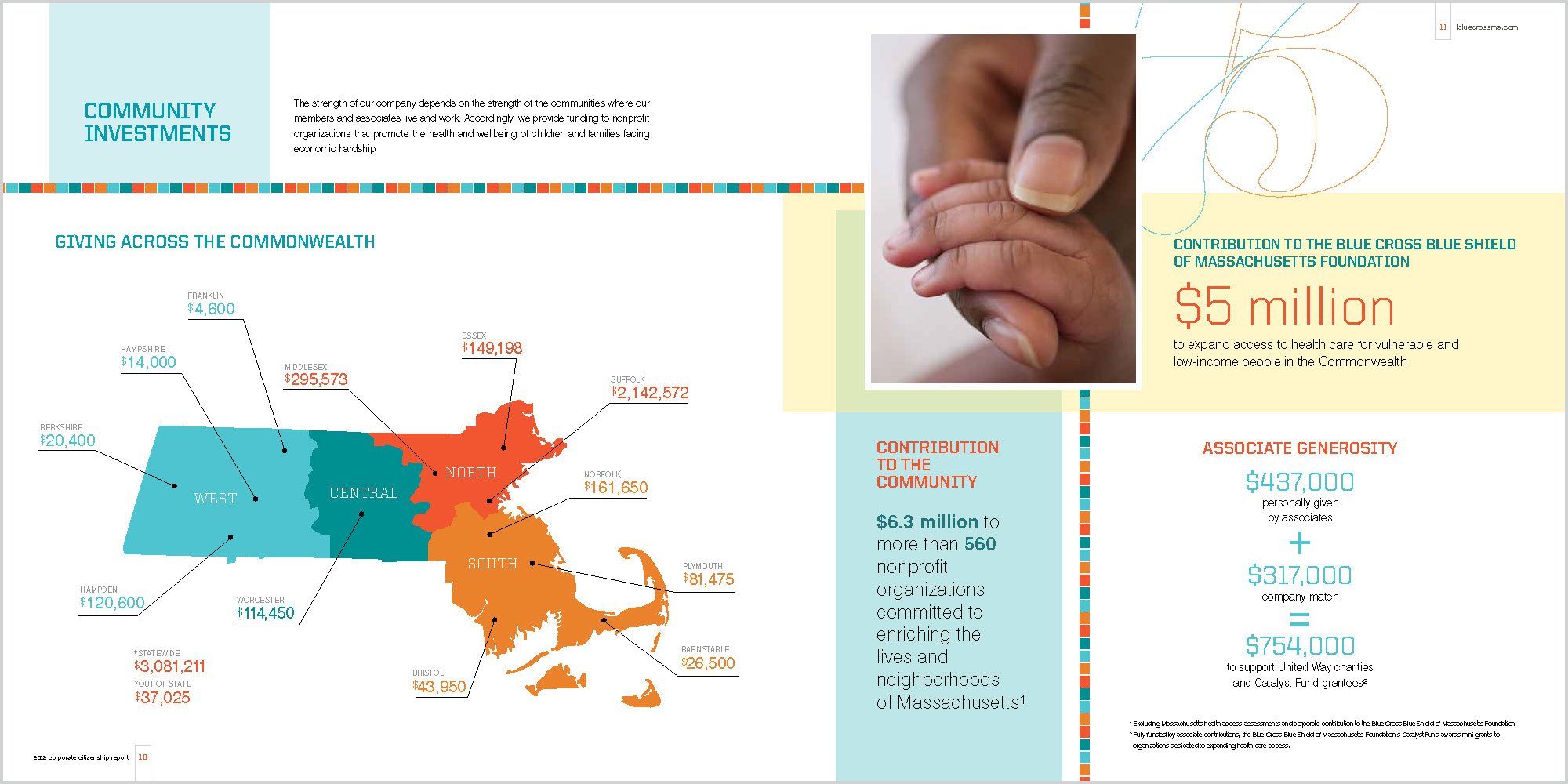
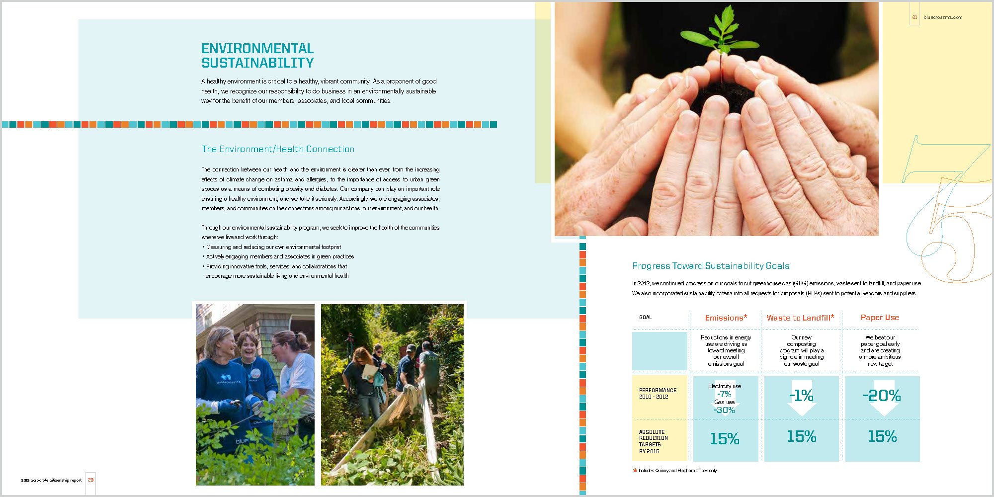
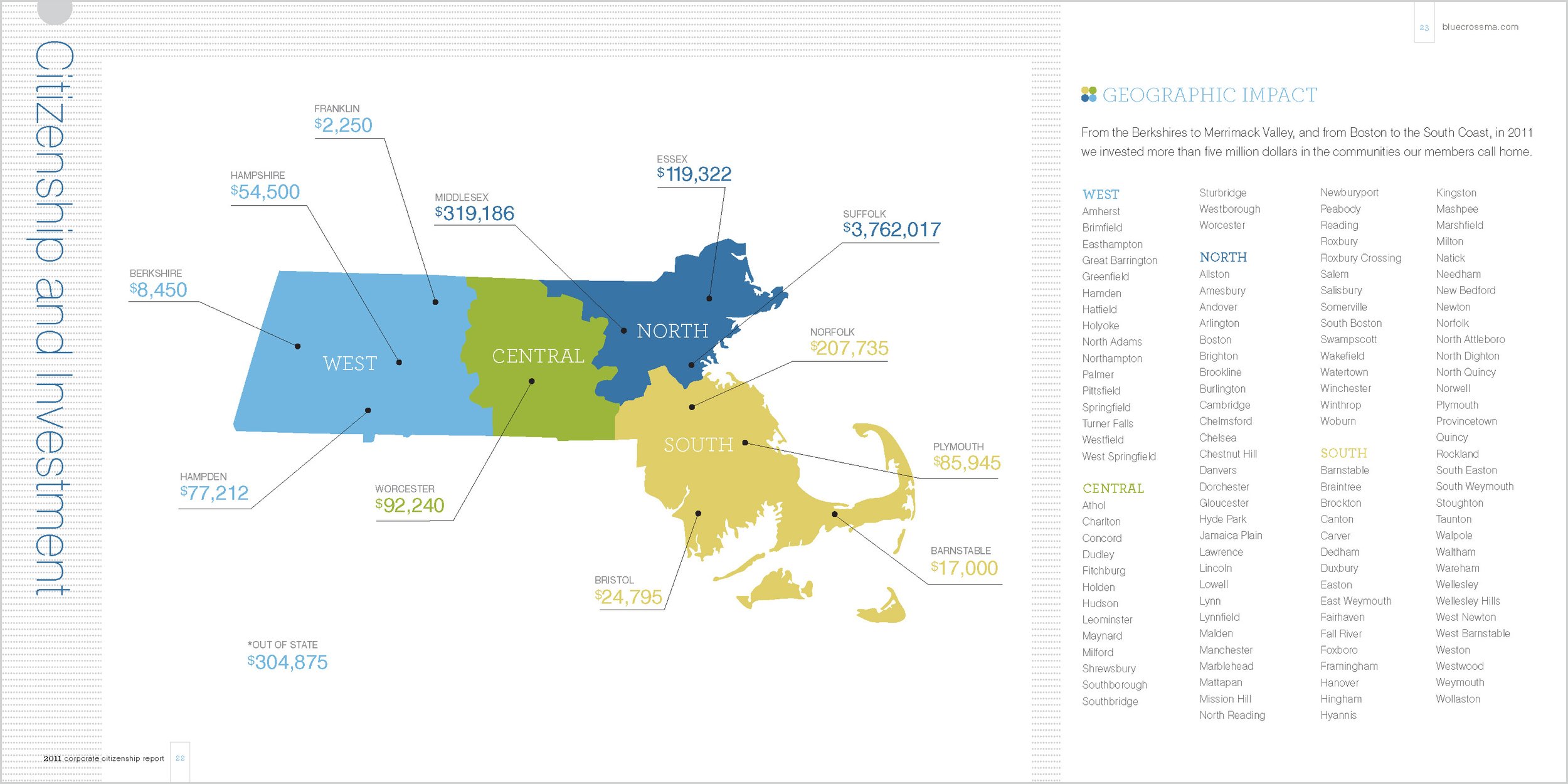
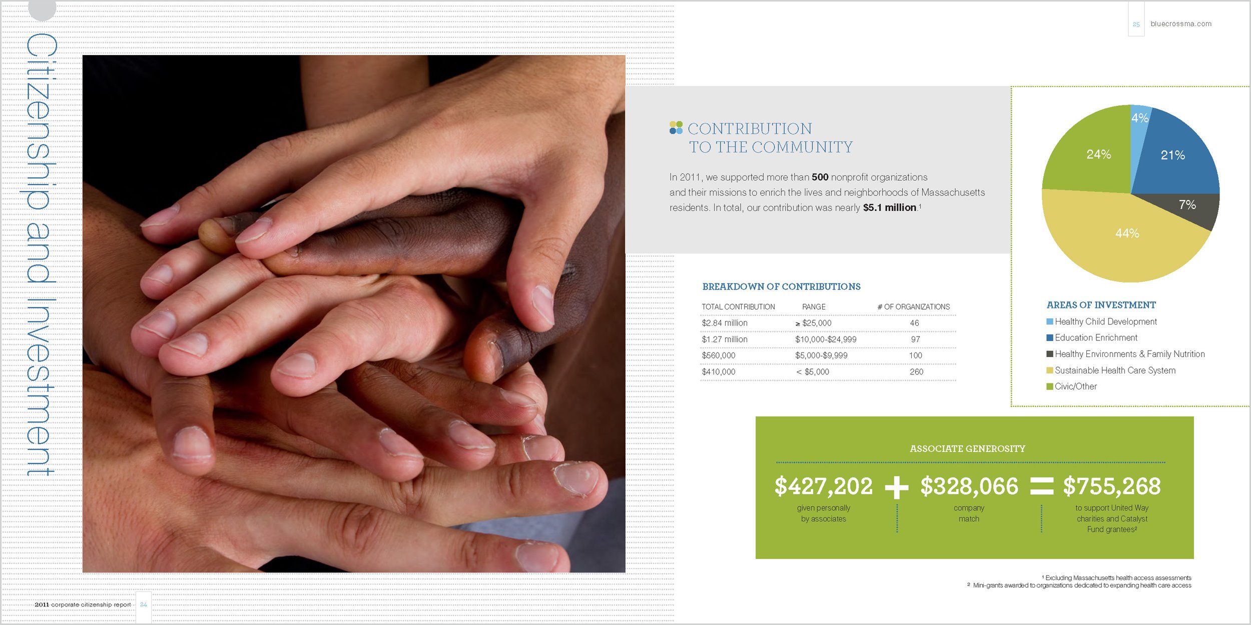
Examples of provided data that was successfully converted into infographics for visual effect to transform complex information into a format that is both accessible and engaging. Visual elements like charts, graphs, and icons simplified data interpretation by providing immediate context and highlighting key points, making it easier for audiences to grasp intricate details at a glance. The use of color, design, and layout not only enhances aesthetic appeal but also guides viewers through the information in a logical and intuitive manner and ties back to the branding guide provided by the client.


